Until now, I’ve never really been interested much in things related to IE9 and hardware accelerated browsers in general – I admit that I don’t really care much for HW accelerated web and doubly so for IE9. When I’ve stumbled upon some complaints about font rendering in IE9, though, my interest was piqued – after all, font rendering is a regular subject on my Czech blog.
So I couldn’t help being curious and I’ve installed the IE9 beta. And soon after that, I couldn’t believe my eyes. Iwanted to make a few comparison screenshots and thought that I might as well include the latest Firefox 4 beta as well, which supports HW acceleration as well. And once again, I couldn’t believe what I was seeing. So the next logical step was to include a Linux FF4 as well which of course also supports HW accelerated content, and from there it went on to become most likely the biggest font rendering comparison I’ve ever done – a comparison that includes all five major browsers on three (well, four, technically) different operating systems. Without further ado, here it is. Let me just warn you that it’s a fairly large image (2405×1801 pixels) and remind you that you should always view if at 100% size without any resizing, of course.
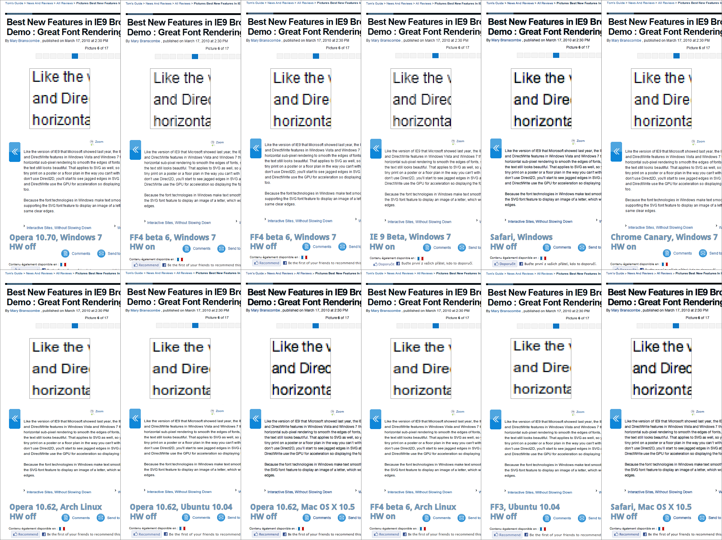
The reason for me making screenshots in both Arch Linux and Ubuntu was personal, for the most part – I was under suspicion that both systems do render fonts differently, even though I’ve got both of them set up the same way. The pictures clearly tell that it’s not the case – they render the fonts exactly the same. Ubuntu was left at default settings (slight hinting), I just installed the Microsoft web core font package (which is also the case with Mac OS X here). Windows 7 Cleartype is slightly tuned, as far as I remember, but the only difference from default should be contrast and gamma correction. Mac OS X was set to “Auto” in font settings and Safari on Windows was set at “Medium – best for flat panel” (as it lacks the Auto setting). The “HW on/HW off” note of course tells you whether the HW acceleration was enabled or disabled in that given browser. The non-accelerated Linux Firefox screenshot was only made with Firefox 3 in Ubuntu, as it saved me doing some redundant OS/browser combinations screenshots. I don’t think it really matters, though – in Linux, HW acceleration has no effect on font rendering. You can also see a certain part of the text zoomed in – this was done manually in Paintshop, the “Zoom” button, visible on most of the screenshots, has nothing to do with that.
I’m very much aware of font rendering being a pretty subjective thing. I still prefer the Linux font rendering (or, to be precise, one of the many possible font renderings you can achieve in Linux), I like it for the (for me) perfect mix of good readability and, at the same time, nice enough glyph shapes. I don’t really have that much of a problem with the other two systems. Mac OS X does sacrifice a bit of readability at the expense of better glyph shapes, but it’s nowhere near serious, and Windows does the exact opposite – it tends to (at least when it comes to “their” fonts – lots of other fonts end up looking much worse) maximize readability, even though the glyphs are not the best there are. Why not. Let everyone pick their favourite font rendering method according to their own taste.
However, I’m quite certain that nobody will choose the font rendering the way HW accelerated IE9 and FF4 do it in Windows (or at least I really hope so). I don’t know what is the reason behind it looking so bad, but this is not good by any means. It’s not an improvement, it’s a step back. One more zoomed in comparison (once again, view at 100 % size):

Both screenshots here are from FF4 – the left one is “non-accelerated” standard Cleartype, the right one is the “accelerated” rendering. It’s interesting to see how inconsistent the accelerated rendering is. Cleartype used to render a single glyph pretty much the same way every time. This is debatable to an extent from the point of glyph shapes, but on the other hand, it certainly helps readability. This time it’s all different, though – one glyph can be rendered very differently in two different instances. Take a look at the “i” in “Like” right at the beginning, and then in the word “version”. The first one is a very sharp glyph, pretty much not showing any signs of subpixel antialiasing. The second one is a smudged, blurry mess. And it’s not like the change is helping to achieve better glyph shapes – even though it’s quite obvious that was at least part of Microsoft’s intention (just compare the “e” in both screenshots to see there’s clearly a difference in the way glyph shapes are preserved), the end result really isn’t very good and the overall text looks like it’s smudged here and there. This also results in text contrast variations – the text seems very uneven, some parts seem lighter, some darker.
Still, it’s interesting to take a look at the Google Chrome Canary build screenshot. This browser does also support the HW acceleration, yet it still renders fonts the “old” way and the readability is as usual. I’m not that much of an expert to know why this happens, but still, it’s pretty obvious that the HW acceleration in itself is most likely not the main culprit here, unless Chrome (or IE9 and FF4) do not implement some of the functions that could have an effect on this issue. It wil also certainly be interesting to see how Opera handles HW acceleration. As for myself, I can tell you with certainty, that if all HW accelerated browsers end up rendering text the same way IE9 beta and FF4 beta do now, turning off the HW acceleration will be the first thing I’ll do in any Windows browser I should be using, because I do find the “new way” of font rendering really ugly and most of all pretty unreadable. And I do wonder what those who consider even Cleartype too “blurry” will say to this.

